Brand guidelines
Make Art. Respect Style. Remember.
How The Mars Touch looks, sounds and moves. Timeless, intentional, evocative, and never louder than it needs to be.
Palette
Four colours. Dark surfaces carry the brand; cream carries the words; gold is the accent and stays rare.
#0A0A0APage background. The default surface.
Cream on ink 16.7:1 · body text (cream 66%) 7.5:1 · gold 5.9:1
#2B1B17The second surface: Remember, the journal, the phone menu.
Cream on espresso 13.9:1 · body text 6.8:1 · gold 4.9:1
#F2EBDDType, the marks, the solid button.
Ink on cream 16.7:1. Body copy is cream at 66%, secondary text cream at 56% (5.4:1 on ink)
#A8874AThe fleur and one hairline rule per section. Nothing else.
Never a fill for large areas, never a gradient, never text longer than a label
Type
Cormorant Garamond speaks: statements, headings, the lede. Montserrat works: body copy, navigation, buttons and the wordmark. Both are self-hosted and free for commercial use under the SIL Open Font License.
The marks
Three marks, always drawn from the master files, never retyped or redrawn.
The primary mark. Keep clear space of at least half its width on every side, and never set it smaller than 16px tall on screen.
Set in type, never placed as an image: Montserrat 700, capitals, tracked +0.32em, in three lines. Sits to the right of the monogram or alone.
From the journal’s deboss dies. Antique gold on dark surfaces, one per section at most. On the site it leans gently toward the cursor.
Don’t
- Add a founding year or “ESTD” to any mark or seal.
- Recolour the marks outside ink, espresso, cream and antique gold.
- Stretch, outline, rotate, add shadows, chrome, metallic or gradient effects.
- Use the wordmark PNG lockups; set the wordmark in type.
- Put the monogram on a busy photograph without a dark scrim behind it.
Voice
We are
Timeless. Intentional. Evocative.
We are not
Celebrity barber. Coach. Guru.
First person, in Mars’s own words. Short sentences, plain language, no hype. The work is the proof; nothing is claimed that isn’t true.
The four locked lines
Used exactly as written, never reworded
- REMEMBER.
- Make Art. Respect Style.™
- What you seek is within.
- The signs were always there.
Motion
What moves
- One hero reveal per visit, finished in under a second.
- Quiet scroll reveals: a short rise and fade.
- The phrase line, slowly, on a 40-second loop.
- On a mouse: the ring cursor, magnetic buttons, the fleur’s lean, the card glow.
- The pulsing dot beside “Coming soon”.
How
- Transform and opacity only.
- Ease out, cubic-bezier(.2,.7,.2,1). Nothing linear except the phrase line.
- 0.5–1.1s. Nothing bounces.
What never moves
- The words themselves: copy is readable without any animation.
- Anything on touch screens beyond the reveals.
- Anything at all when a visitor asks for reduced motion.
Surfaces
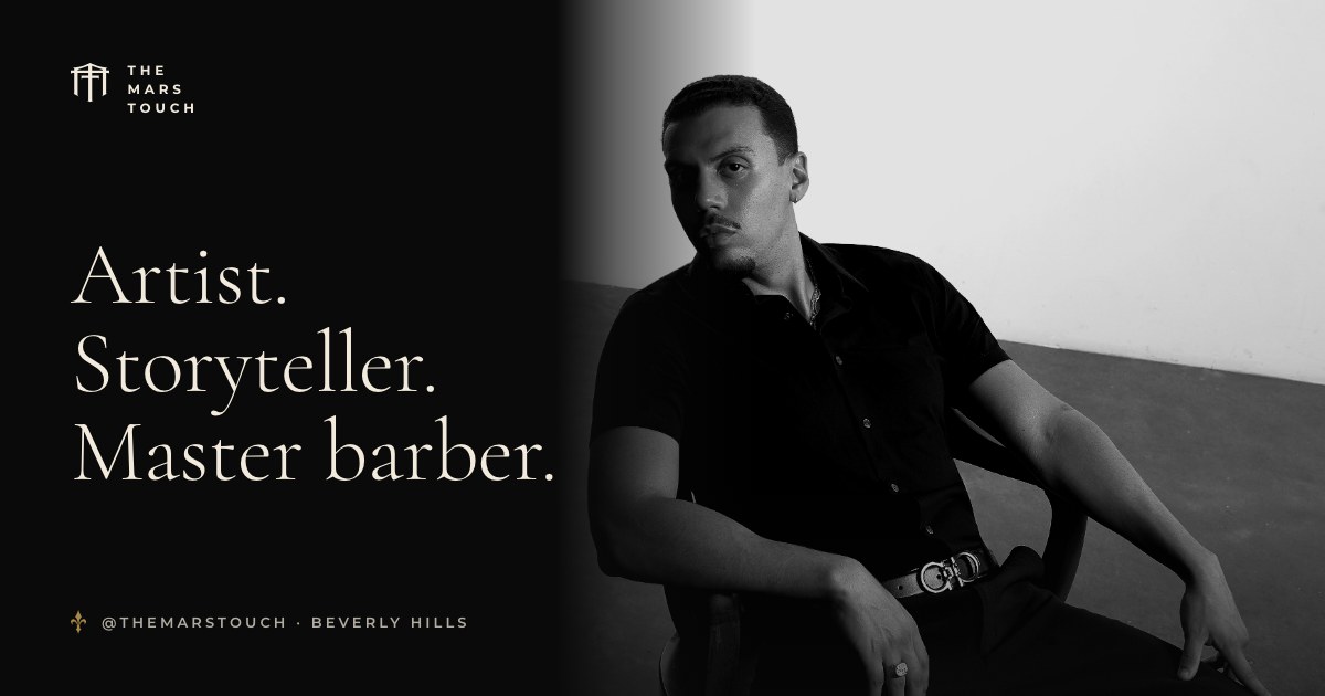
Most of the page. Photography sits on it in black and white or full colour, with a soft ink fade where it meets type.
For the philosophy and the journal: the warm, leather-bound side of the brand.
A surface only in small doses: the solid button and printed matter. Never a full page.
A fine film grain sits over every surface so the dark never reads as a flat screen.